
What a Whopper can teach you about your website
What a Whopper Can Teach You About Your Website
I was chatting with Colin the other day and said, “I’m going to grab a Whopper for lunch.” It was just one of those days. A Whopper kind of day. Empty food, bad calories, nothing especially fancy.
Which is ironic, because I take care of myself. I’m riding 50km a day in the summer, lifting weights three times a week, doing everything right most of the time. But every now and then, that Whopper just calls your name. Maybe it’s nostalgia. That “treat of the week” feeling from when you were a kid. You know exactly what it is, but you go for it anyway. And that’s where things went sideways, because somehow that turned into a conversation about websites.
Where it actually came from
The whole thing came from those agency runs. Wednesdays meant Whopper Wednesday at the Burger King on Lansdowne Street in Peterborough. It was just routine, nothing special at the time, which makes it funny that Colin remembered way more of it than I did. Specific moments, little details that stuck with him that I’d completely forgotten.
Somewhere in that conversation, between remembering those runs and the idea of grabbing one again, we landed on something that actually stuck. Whopper. Website. Same starting letter. Same kind of experience. It sounds stupid until you think about it for more than five seconds, and then it becomes uncomfortably accurate.
The expectation versus reality problem
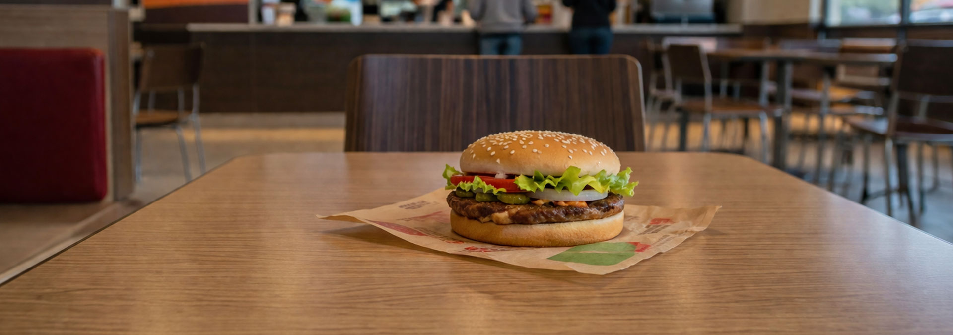
A Whopper in an ad looks incredible. Everything is perfectly stacked, the lettuce is crisp, the bun is flawless, and the whole thing looks like it was assembled with intention. Then you open the wrapper, and the last one I had was brutal. Big chunks of lettuce with browned edges, soaked in grease, barely holding together. You pick it up and it’s already falling apart before the first bite.
That gap between what you were sold and what you actually get is exactly what happens with a lot of websites. You see the polished version first, whether it’s a pitch, a mockup, or a carefully designed homepage, and then you land on the real thing and something feels off. It might not be broken, but it’s clunky, slow, awkward, or just not what you expected.
The real problem isn’t how it looks
As frustrating as that is, the visual mismatch isn’t even the worst part. The real issue with that burger isn’t just how it looks, it’s what’s underneath it. It’s greasy, over-processed, and built for speed instead of care. It fills a hole, but it doesn’t leave you feeling like you made a great decision.
That’s the part that maps perfectly to websites. A lot of sites today are built the same way. They’re assembled quickly, designed to look acceptable on the surface, and pushed live without much thought about what’s going on underneath. The result is something that technically works, but isn’t built to last or evolve.
The website version of junk food
Platforms like Wix, Squarespace (arguably), and GoDaddy make it incredibly easy to launch a website, and for a lot of people that’s appealing. The problem is what comes with it. Under the surface, you often end up with bloated code, layered features that weren’t designed to work together cleanly, and structural limitations that don’t become obvious until you try to do something even slightly outside the template.
Performance takes a hit, customization becomes awkward, and the whole thing starts to feel fragile. It works, but it doesn’t feel solid. It’s the digital version of empty calories. You feel like you’ve solved the problem because something exists, but it’s not actually doing much for you.
It works until it doesn’t
That burger barely holding together is the part that really sticks, because it reflects what happens over time. You launch a website and everything seems fine, and then things start to stack up. You try to update something and it breaks. You add one more plugin and something conflicts. You tweak a layout and it looks wrong somewhere else.
You start working around the system instead of working with it. At some point, you’re not building anymore, you’re just holding it together.
The trap is the convenience
Nobody orders a Whopper expecting something high-end. You order it because it’s fast, easy, and right there. The same logic applies to websites. Templates and builders solve the immediate problem really well. You need a site, you get a site, done.
But that convenience comes with tradeoffs that don’t show up until later, and by the time they do, you’re already dealing with them instead of avoiding them.
Where AI fits into this
AI is making all of this faster and more polished. You can generate layouts, write content, and get something that looks decent in a fraction of the time it used to take. That’s a real improvement, but it’s still operating within the same system.
- It makes the fast option better
- It doesn’t change what the fast option is
- It doesn’t understand your business
- It doesn’t make judgment calls about what actually matters
It helps assemble something more quickly, but it doesn’t replace intent.
The point
There’s nothing wrong with grabbing a Whopper. Sometimes you need something quick and easy and it does exactly what it’s supposed to do. And the same goes for websites. If you just need something basic to exist, those platforms are fine.
But if your website is supposed to represent your business, bring in clients, and actually do work for you, then what’s under the surface matters more than people think. Because your website isn’t just something you have, it’s something people experience.
Final thought
That whole conversation started as a joke, but it stuck because it highlights something real. The easy option usually comes with tradeoffs you don’t see right away, and by the time you do, you’re already deep into it.
- No templates forcing your content into place
- No patchwork fixes after launch
- No compromises on how your business is represented
We build around what you need, how your business works, and how your customers interact with it, because if your website is going to represent your business properly, it shouldn’t feel like it came out of a wrapper.
We’re not the web version of fast food, but Burger King and Firefly still share one thing in common: Have it your way.